21,95 €
21,95 €
inkl. MwSt.
Sofort per Download lieferbar
payback
11 °P sammeln
21,95 €
21,95 €
inkl. MwSt.
Sofort per Download lieferbar

Alle Infos zum eBook verschenken
payback
11 °P sammeln
Als Download kaufen
21,95 €
inkl. MwSt.
Sofort per Download lieferbar
payback
11 °P sammeln
Jetzt verschenken
21,95 €
inkl. MwSt.
Sofort per Download lieferbar

Alle Infos zum eBook verschenken
payback
11 °P sammeln
  • Format: PDF


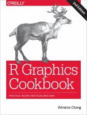
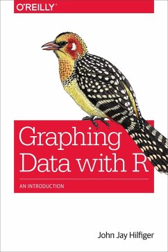
It's much easier to grasp complex data relationships with a graph than by scanning numbers in a spreadsheet. This introductory guide shows you how to use the R language to create a variety of useful graphs for visualizing and analyzing complex data for science, business, media, and many other fields. You'll learn methods for highlighting important relationships and trends, reducing data to simpler forms, and emphasizing key numbers at a glance.
Anyone who wants to analyze data will find something useful hereeven if you don't have a background in mathematics, statistics, or computer
…mehr

  • Geräte: PC
  • mit Kopierschutz
  • eBook Hilfe
  • Größe: 16.85MB
  • FamilySharing(5)
Produktbeschreibung


It's much easier to grasp complex data relationships with a graph than by scanning numbers in a spreadsheet. This introductory guide shows you how to use the R language to create a variety of useful graphs for visualizing and analyzing complex data for science, business, media, and many other fields. You'll learn methods for highlighting important relationships and trends, reducing data to simpler forms, and emphasizing key numbers at a glance.

Anyone who wants to analyze data will find something useful hereeven if you don't have a background in mathematics, statistics, or computer programming. If you want to examine data related to your work, this book is the ideal way to start.

  • Get started with R by learning basic commands
  • Build single variable graphs, such as dot and pie charts, box plots, and histograms
  • Explore the relationship between two quantitative variables with scatter plots, high-density plots, and other techniques
  • Use scatterplot matrices, 3D plots, clustering, heat maps, and other graphs to visualize relationships among three or more variables

Dieser Download kann aus rechtlichen Gründen nur mit Rechnungsadresse in A, B, BG, CY, CZ, D, DK, EW, E, FIN, F, GR, HR, H, IRL, I, LT, L, LR, M, NL, PL, P, R, S, SLO, SK ausgeliefert werden.

Autorenporträt
John Jay Hilfiger is a statistician, with an MS in biostatistics. He has worked as a statistical/computer consultant in three major universities (Rochester, Iowa, Cornell). He has also made heavy use of his data background in positions as associate dean and as director of institutional research. In addition, Hilfiger is a composer/arranger (over 100 publications) and has been a music professor (masters and PhD in music). A big part of his experience has been helping other people analyze their data with numbers, graphs and insight; writing this book is an extension of that pursuit. He also has a